- We will send in 10–14 business days.
- Author: Lewis Carroll
- Publisher: EVERTYPE
- Year: 2015
- Pages: 156
- ISBN-10: 1782011293
- ISBN-13: 9781782011293
- Format: 14 x 21.6 x 0.9 cm, minkšti viršeliai
- Language: English
- SAVE -10% with code: EXTRA
Reviews
Description
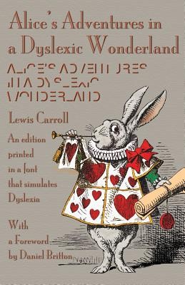
In 2013, Daniel Britton initiated a project at the London College of Communication to recreate the feeling of reading with dyslexia-to try and instil a sense of empathy between non-dyslexics and dyslexics. To accomplish this, he designed a typeface that would be almost illegible and slow down the reading pace of a non-dyslexic person to the speed of a dyslexic, recreating the frustration and embarrassment of reading with the condition. Britton's typeface design doesn't simulate letters jumping around on the page or anything like that-it just breaks the reading time of a non-dyslexic down to the speed of a dyslexic. With fonts specially produced by Michael Everson, this edition has been typeset in keeping with Britton's design objectives.
EXTRA 10 % discount with code: EXTRA
The promotion ends in 21d.08:10:57
The discount code is valid when purchasing from 10 €. Discounts do not stack.
- Author: Lewis Carroll
- Publisher: EVERTYPE
- Year: 2015
- Pages: 156
- ISBN-10: 1782011293
- ISBN-13: 9781782011293
- Format: 14 x 21.6 x 0.9 cm, minkšti viršeliai
- Language: English English
In 2013, Daniel Britton initiated a project at the London College of Communication to recreate the feeling of reading with dyslexia-to try and instil a sense of empathy between non-dyslexics and dyslexics. To accomplish this, he designed a typeface that would be almost illegible and slow down the reading pace of a non-dyslexic person to the speed of a dyslexic, recreating the frustration and embarrassment of reading with the condition. Britton's typeface design doesn't simulate letters jumping around on the page or anything like that-it just breaks the reading time of a non-dyslexic down to the speed of a dyslexic. With fonts specially produced by Michael Everson, this edition has been typeset in keeping with Britton's design objectives.


Reviews